UNIFYING THE CONNECTED
ASSET MANAGEMENT EXPERIENCE
BRANDING / UX STRATEGY / DESIGN VISION / TEAM LEAD
Project Background:
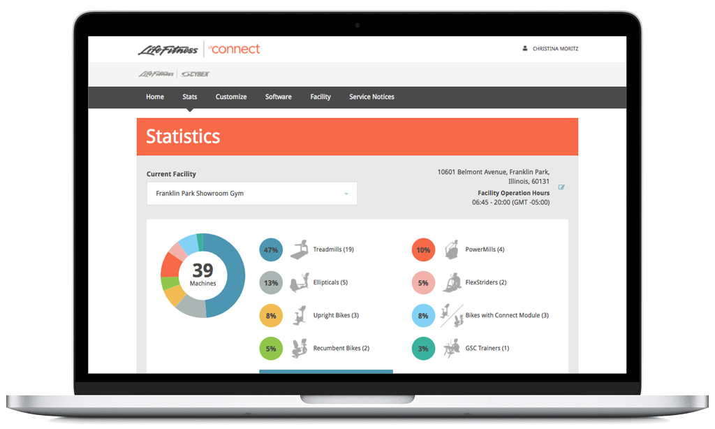
LFconnect.com was launched in 2012. When the team took control of the platform in 2014, we needed to scale to support more than one connected product. With a growing portfolio of cardio equipment and opportunity to onboard customers to a connected club experience, it was prime time to rebrand and give the site a facelift, while scaling the foundation of the platform. We built a connected ecosystem across the LFconnect subbrand, one that was translated into more than 20 languages.
Old site supporting one product
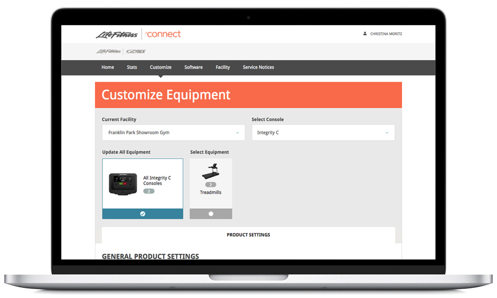
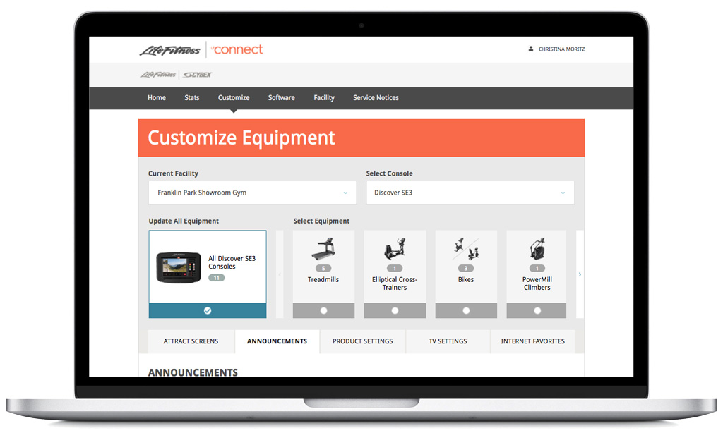
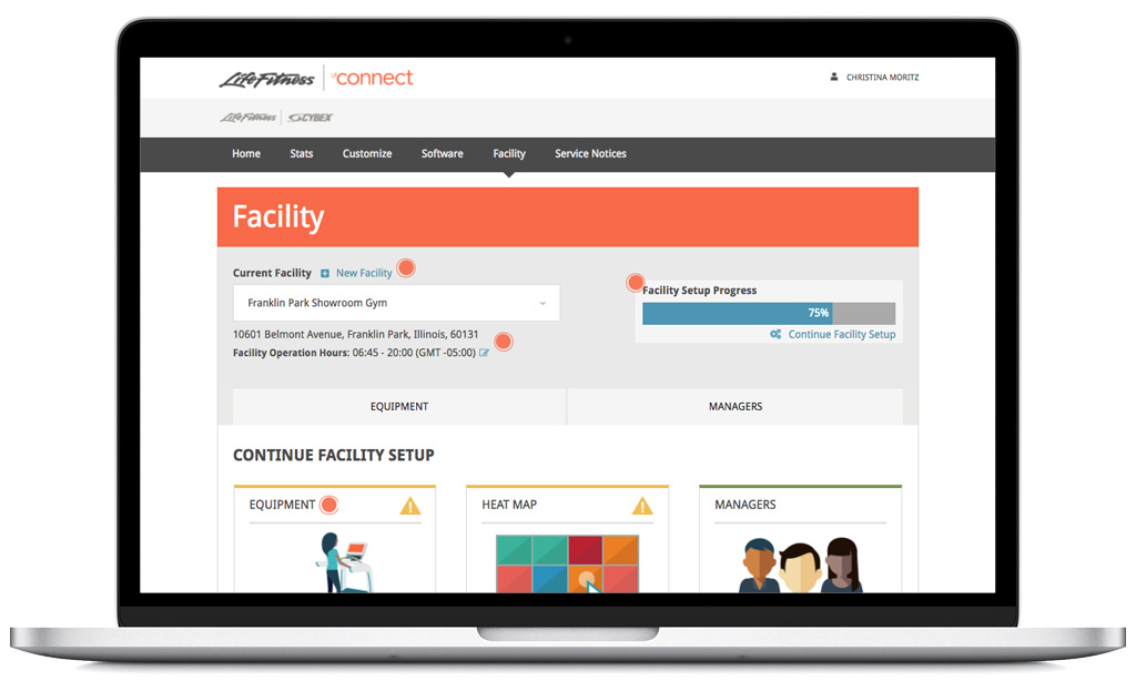
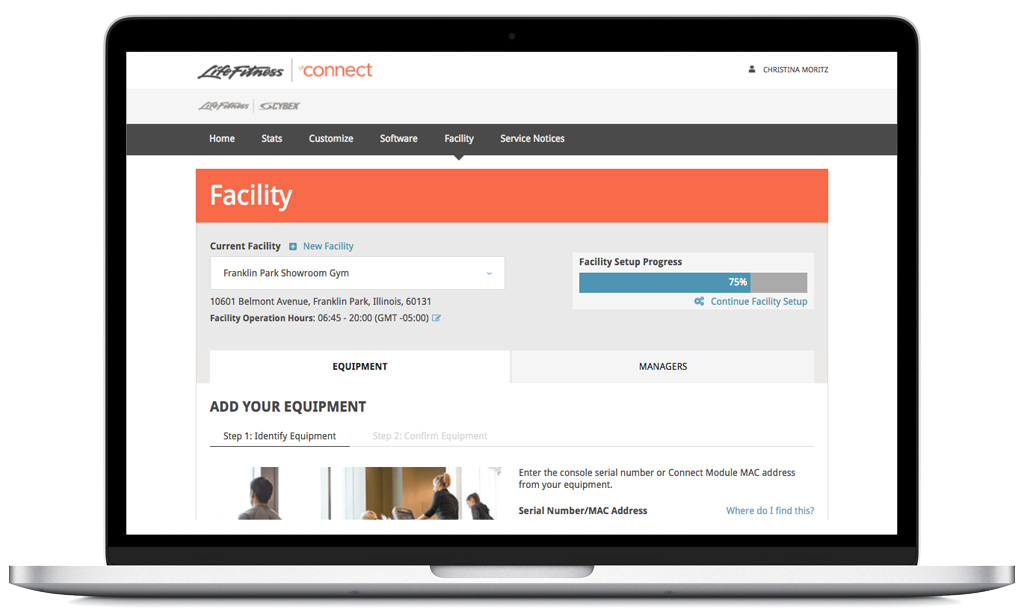
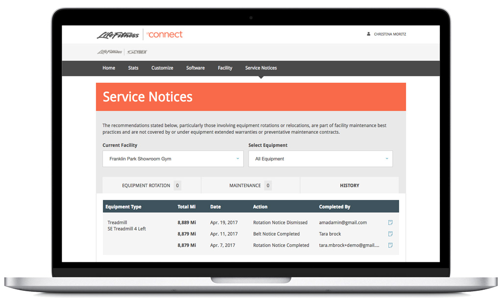
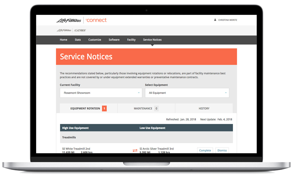
New site supporting more than 10 products and two brands
Results:
We simplified navigation and allowed a customer to manage all connected equipment types from the same location. We also simplified the navigation scheme, making the site easier to use and more translatable for international users. A more robust style guide, enhanced html, connection to a parts website helped to complete the user journey. Our vision was to have one connected ecosystem. This strategy set us up for success to continue adding features and fully integrate future product brands, leading us to the launch of Halo Fitness.
Deliverables:
Expanded product compatibility and scaled user experience
Site architecture and navigation
Card sorting, tree testing and usability research
Consolidated design language across ecosystem platforms
Rebrand and UX strategy
New feature introduction UX/UI
Design team management


